Course Revamp
Redesigning and improving existing eLearning courses to enhance accessibility, usability, and visual consistency.

Focus
Accessibility · UX · visual design
Scope
Multiple courses · system-wide improvements
Outcome
Improved usability, clarity, and engagement
The Challenge
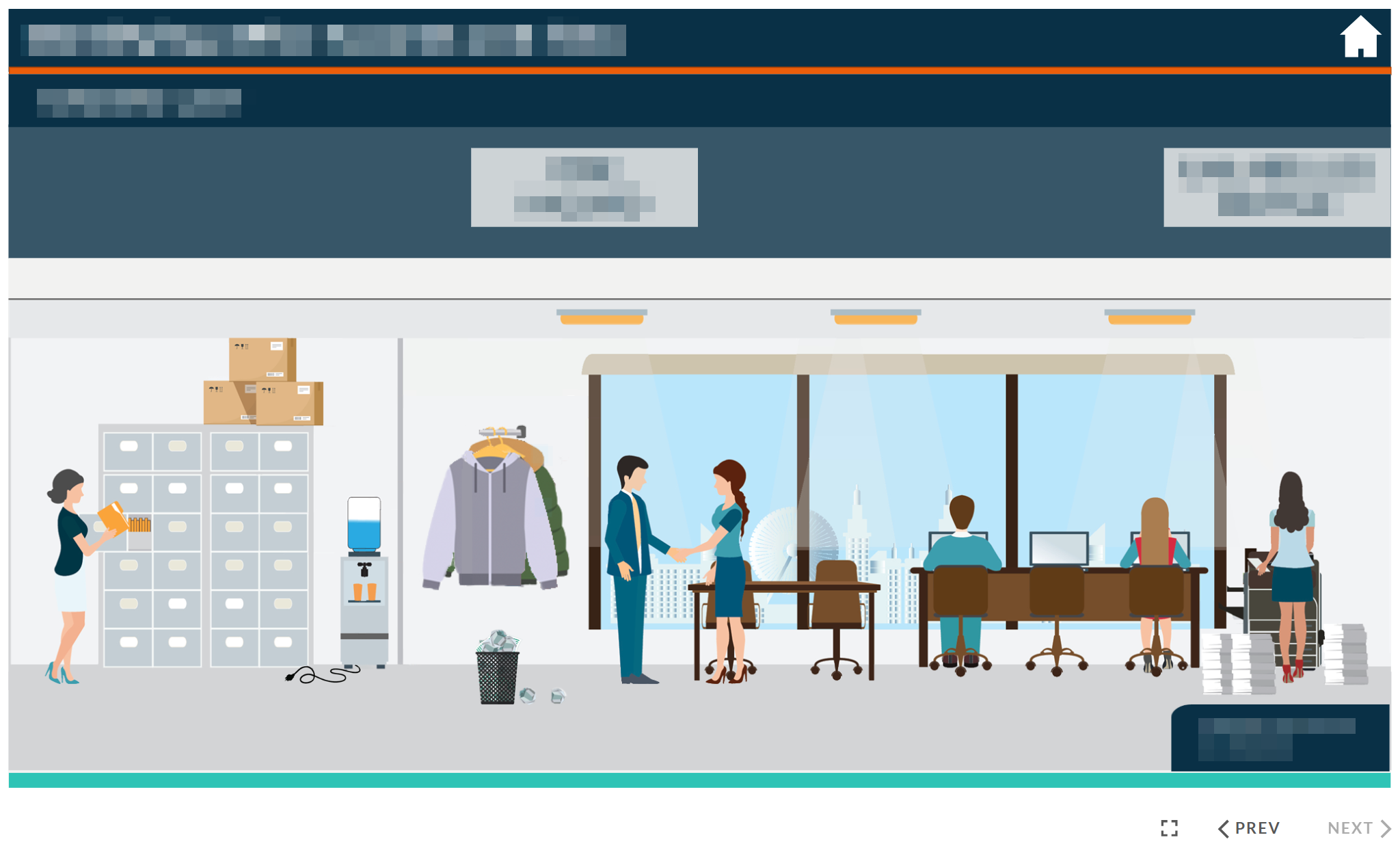
The existing courses had been developed rapidly by a third party and lacked key accessibility features. The overall design was inconsistent, and content was often overly wordy or repetitive.
There was also a need to align the courses with updated branding and improve interactivity without disrupting the existing structure.
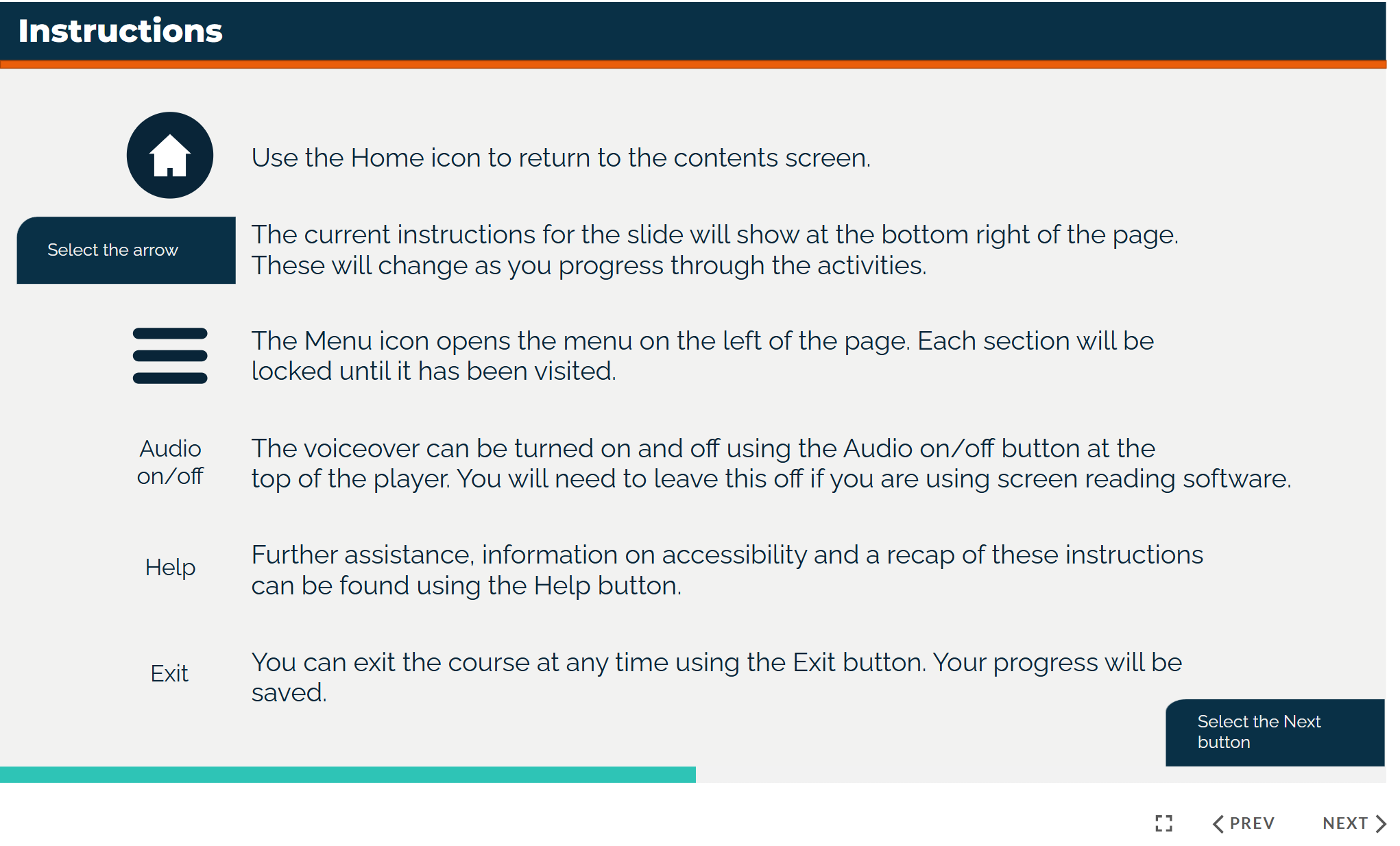
Navigation Redesign
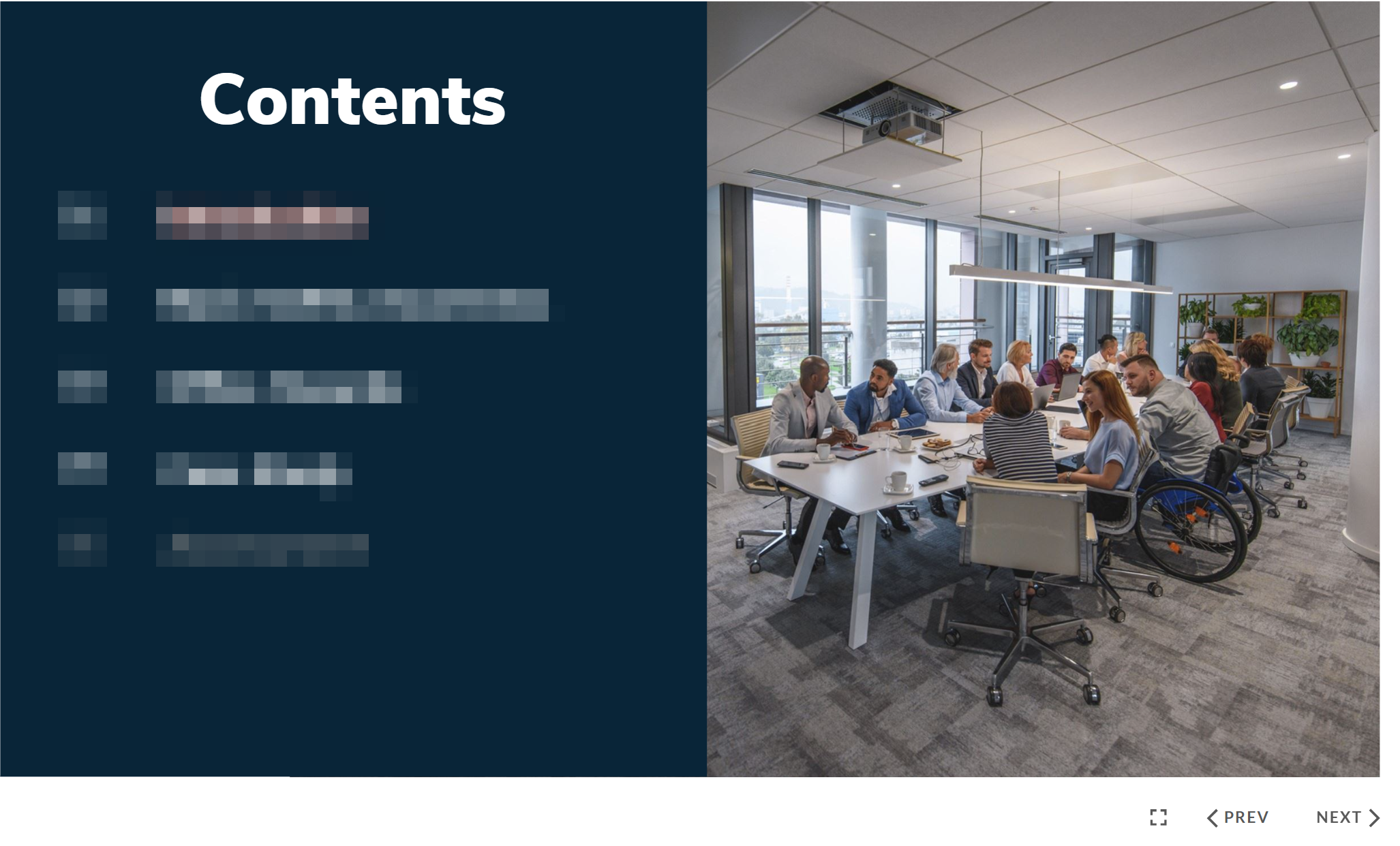
Before
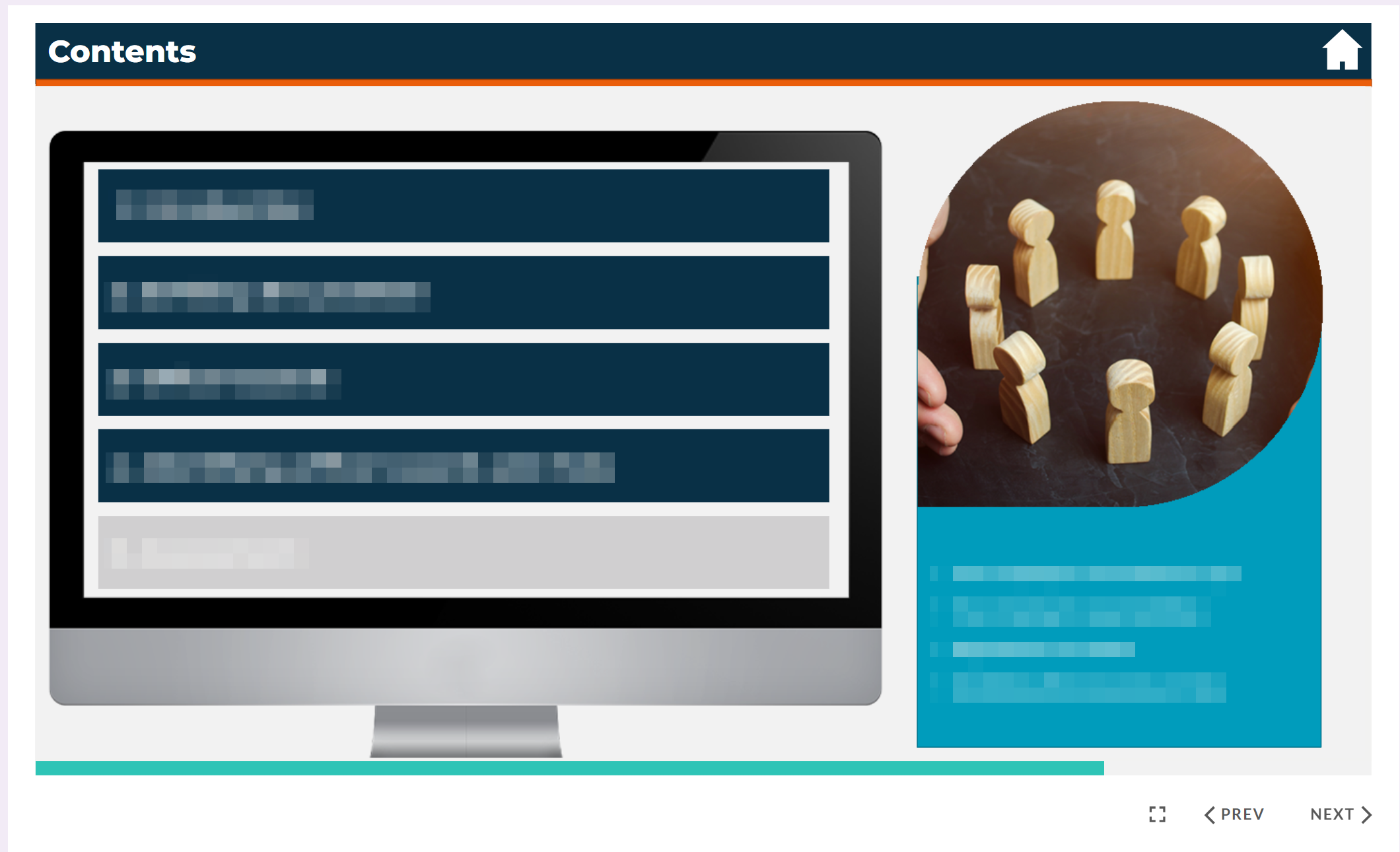
After
Visual & Branding Update
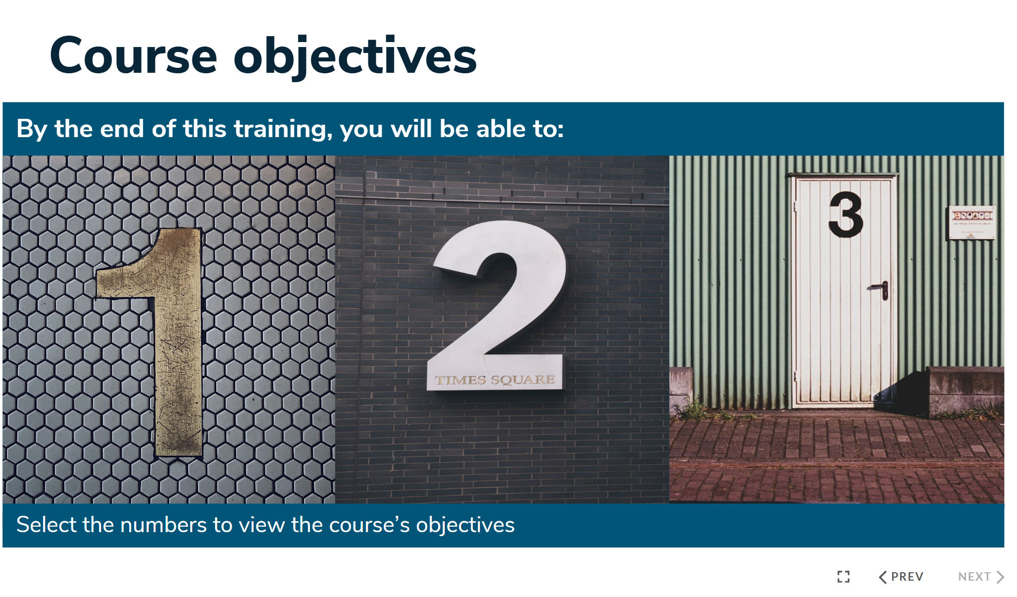
Before

After
Interaction Improvement
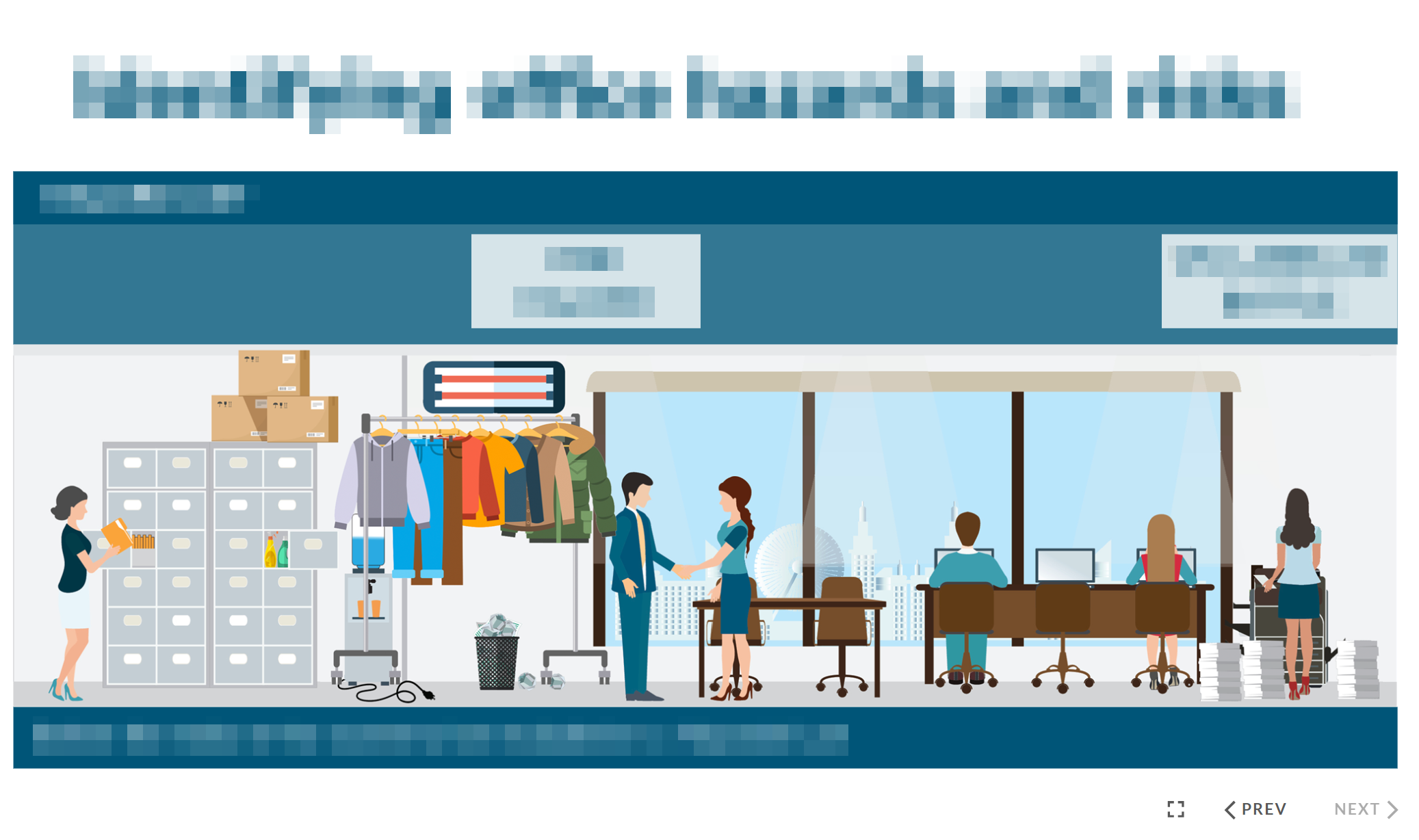
Before
After
The original hazard spotting activity made it difficult for learners to track which items had already been selected. This was redesigned so that hazards were visually “corrected” when clicked, improving clarity and usability.
The Solution
- • Redesigned core screens across all courses for consistency
- • Applied updated branding using the company’s website as a reference
- • Made courses fully accessible
- • Added a progress bar and clear instruction page
- • Streamlined text to remove repetition and improve clarity
- • Introduced and improved interactive elements
The Outcome
The redesigned courses delivered a more accessible, consistent, and engaging learning experience. Improvements to navigation, clarity, and interaction made the content easier to follow, while the updated visual design aligned the courses with the organisation’s brand.